A single misplaced letter in a button label can confuse a user at the worst possible moment. In UX writing, the stakes attached to every …


A single misplaced letter in a button label can confuse a user at the worst possible moment. In UX writing, the stakes attached to every …

Raw product text rarely arrives in a usable state. It comes from interviews, spreadsheets, Slack threads, support tickets, and half-formed product requirements. It is fragmented, …
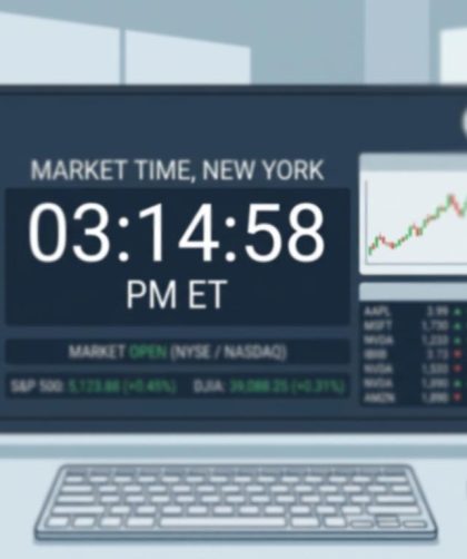
Time sits quietly in almost every interface. It appears in dashboards, booking flows, financial apps, and operating systems. Yet the clock is rarely treated as …

Great microcopy rarely starts in a design file. It starts in a real conversation. A user explaining what confused them. A pause before clicking. A …

The second something starts moving on a screen, trust is on the line. A clock ticks. A countdown drops from 10 to 9. A status …
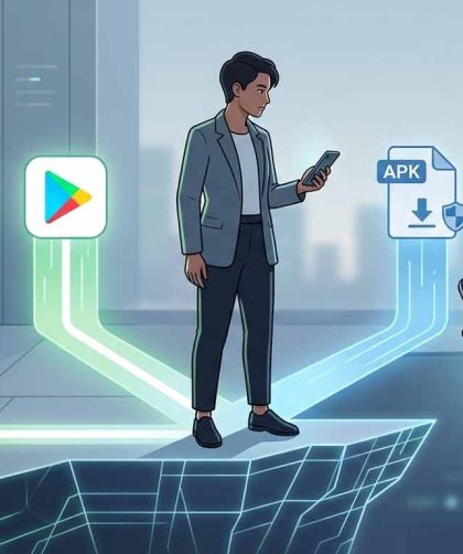
The moment someone decides to install your Android app, you are standing at the edge of a cliff. One tap sends them to the Play …
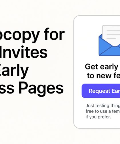
Beta invites often mark the first point of contact between your product and a potential user. The words used on these pages either build anticipation …
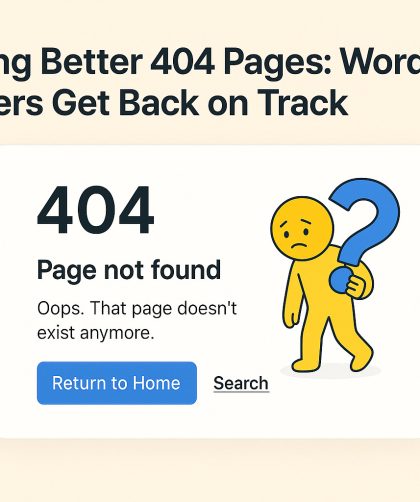
A 404 page doesn’t have to feel like a dead end. Users land on these pages because something broke—a bad link, a deleted page, or …
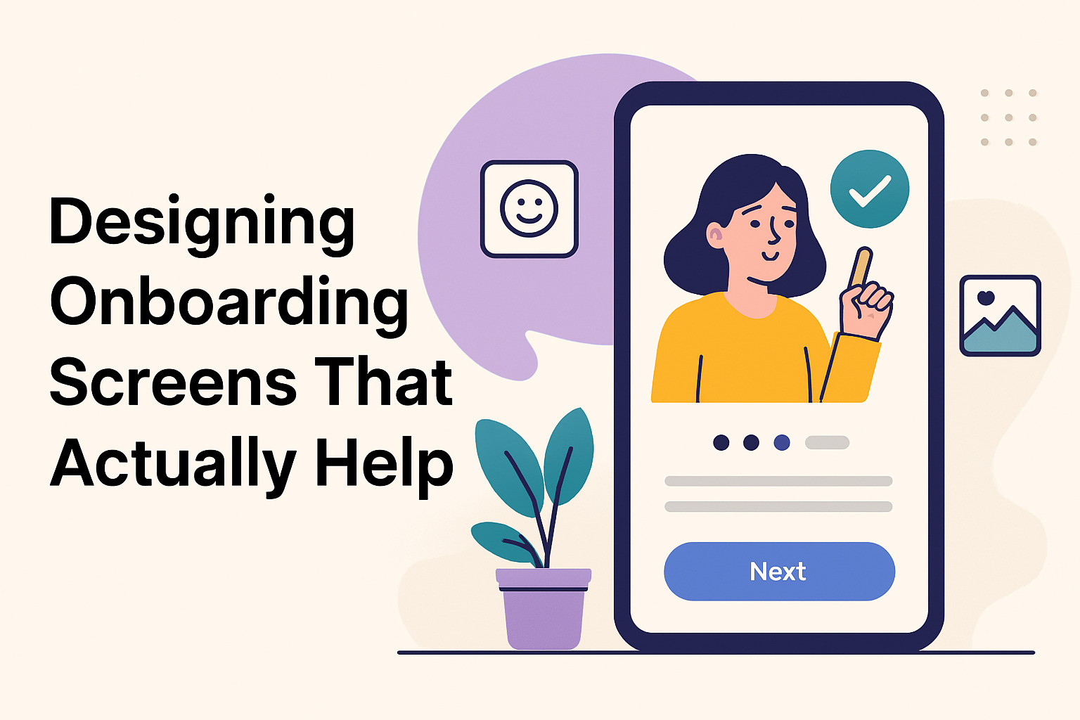
User onboarding is more than a brief welcome; it sets the tone for the entire experience. Clear guidance, engaging design, and thoughtful interactions ensure that …
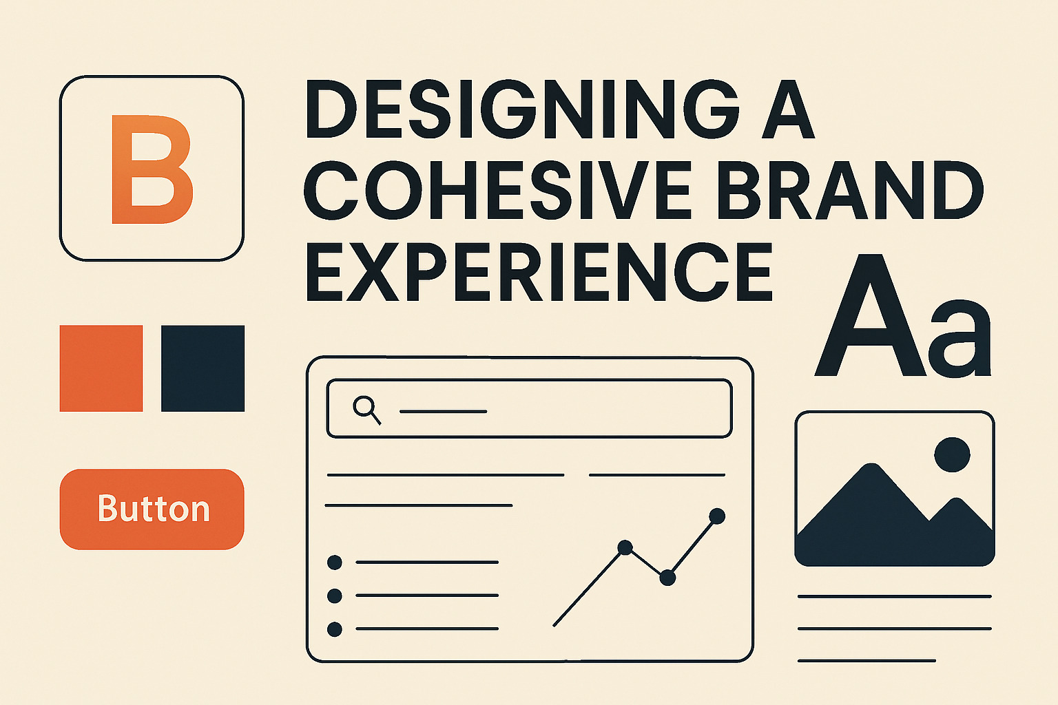
Creating a unified brand experience across UI elements means ensuring that every visual component works together to communicate a clear message. This article explains how …