Designing a Cohesive Brand Experience Across UI Elements
Creating a unified brand experience across UI elements means ensuring that every visual component works together to communicate a clear message. This article explains how thoughtful design, attention to detail, and consistency can build a memorable interface that supports your brand’s voice and style. A unified look makes interactions smoother, fosters trust, and guides users intuitively through your digital offerings.
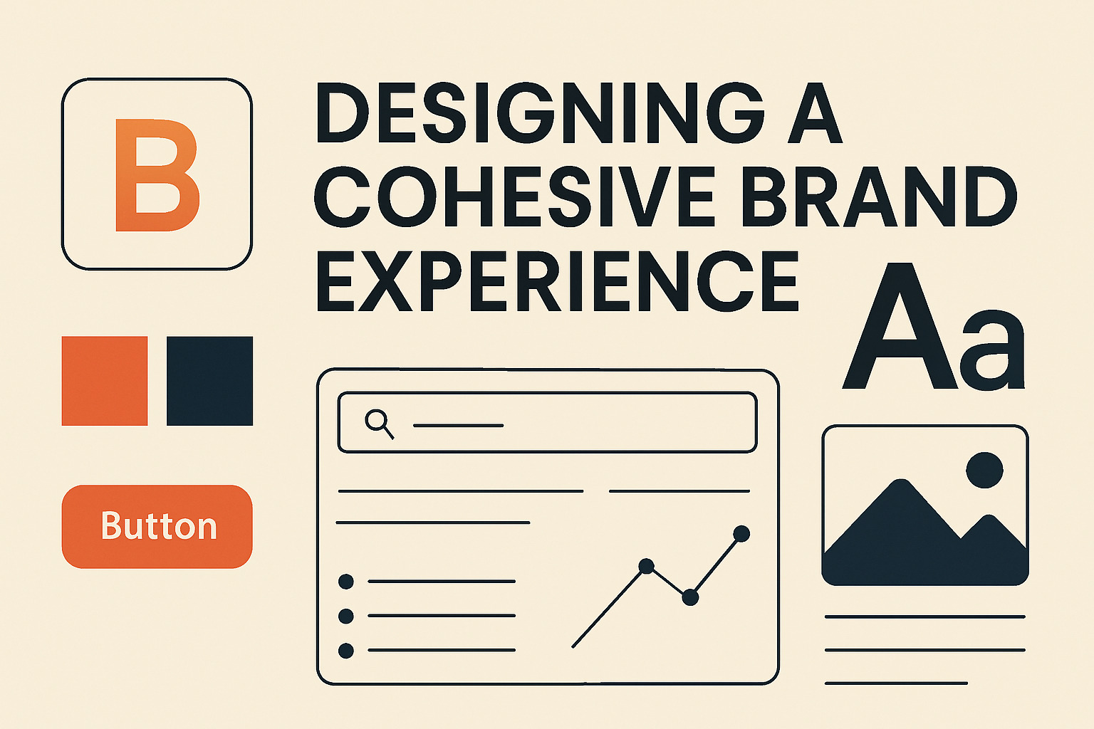
Establishing a Unified Visual Language
A strong visual language defines the way your brand speaks without words. It starts with a well-defined color palette, typography, and iconography that reflect the brand’s personality. Establishing these elements early in the design process serves as a reference point for all UI components. Consistency in these areas reassures users and reinforces the brand message.
- Color Palette: Choose a primary color that resonates with your brand and a secondary palette that complements it. Use these consistently across backgrounds, buttons, and highlights.
- Typography: Select one or two fonts that communicate your brand’s tone. A clear typographic hierarchy helps users understand what matters most.
- Iconography: Icons should follow the same visual style as other UI elements. They offer visual shortcuts and aid in navigation.
UI Elements as Brand Touchpoints
Each button, form field, and image contributes to the overall brand experience. The design of these elements should reflect the brand’s character and ensure that users are guided effortlessly through your interface. Consistent styling reduces friction and makes the digital experience intuitive.
- Buttons and Controls: Use uniform shapes, sizes, and colors. This creates an interface where users immediately recognize interactive elements.
- Forms and Input Fields: Clearly labeled fields and consistent layouts prevent confusion. A cohesive design helps in reducing user errors.
- Navigation Menus: A well-organized menu with a consistent layout builds familiarity and improves usability.
The Role of Imagery and Illustrations
Imagery, including photographs, illustrations, and graphics, plays a key role in defining a brand’s identity. Choose visuals that align with your design principles. Each image should be treated as a piece of the larger puzzle that conveys your brand story. Consistency in image style—whether modern, minimalist, or vibrant—ensures that every part of the UI speaks the same language.
- Photography: Use images that mirror your brand’s mood. Consistent lighting, color grading, and subject matter help in creating a uniform visual narrative.
- Illustrations: Custom illustrations can set your brand apart. Maintaining a similar style across all illustrations ties together diverse elements into a cohesive story.
Consistency in Micro-Interactions
Small interactions such as hover effects, button animations, and loading indicators contribute to the overall feel of your interface. These details, while subtle, create a sense of continuity. When these micro-interactions are designed with consistency in mind, they provide feedback that feels familiar to the user, reinforcing the brand’s personality.
- Feedback Animations: Use similar animation speeds and easing curves for transitions. Consistent motion design creates an environment where actions feel deliberate and thoughtful.
- Hover Effects: Apply a consistent hover effect to interactive elements. This small detail informs users and improves engagement.
Integrating Brand Assets Seamlessly
Every UI element should be a reflection of your brand’s identity, including small details that might otherwise be overlooked. An often-understated aspect is the role of favicons. For instance, a favicon generator streamlines the process of aligning favicons with your overall design, ensuring a consistent visual identity. This minor detail plays a subtle yet vital role in brand recognition, especially in browser tabs and bookmarks.
Guidelines for Consistent Layouts
Layout consistency ensures that users feel comfortable navigating through different sections of your site. A clear grid system provides structure, and spacing guidelines create balance. Consistent margins, paddings, and alignments lead to an interface where content is organized and easy to digest.
- Grid Systems: Use a standard grid to organize elements. A common grid layout aids in the systematic placement of components.
- Spacing: Uniform margins and paddings ensure that elements do not appear cluttered. Adequate whitespace allows each component to breathe.
- Alignment: Align text and images consistently. This practice creates visual harmony and reinforces the overall brand message.
Final Thoughts on Cohesive Design
A cohesive brand experience results from meticulous planning and attention to detail. It encompasses every part of the interface, from colors and typography to micro-interactions and imagery. Each UI element, no matter how small, contributes to a comprehensive narrative that users recognize and appreciate. Through deliberate design choices and adherence to a consistent visual language, your interface can tell a compelling story that resonates with your audience.
By focusing on uniformity across all UI elements, you set the stage for an experience that feels both deliberate and delightful. Consistency breeds familiarity, and familiarity builds trust, ultimately guiding users smoothly through every interaction on your site.