When to Use Emoji in UI Copy and How to Do It Right
When to Use Emoji in UI Copy and How to Do It Right
Putting a 🎉 in your onboarding headline feels fun. Until it shows up as a box on someone’s screen. Or a screen reader announces “party popper” in the middle of a sentence that was supposed to feel warm and encouraging. Emoji can do a lot of good in interface copy. They can also quietly undo the tone you worked hard to build. The difference usually comes down to one thing: intentionality.
Emoji in microcopy work best when they reinforce meaning rather than decorate it.
- Match emoji to the emotional register of the surrounding copy, not just the topic.
- Always check how an emoji renders across major platforms before it ships.
- Write copy that works without the emoji first, then add it only if it genuinely adds something.
Tone First, Emoji Second
The most common mistake writers make with emoji is treating them like decoration. A checkmark ✅ at the end of a success message might feel like a nice touch. But if your product has a formal, minimal brand voice, that checkmark quietly contradicts the tone you have been building across every other screen.
Before you reach for an emoji, ask what the copy is trying to do. Is it reassuring a nervous new user? Is it celebrating a milestone? Is it explaining a limitation? Each scenario carries a different emotional weight. The emoji has to match that weight, not just loosely relate to the topic.
Empty states are a useful example of this tension. A sad face 😞 next to “No results found” might feel empathetic on a casual consumer app. On a B2B dashboard, it can read as childish. The same emoji, the same intent, two completely different outcomes depending on the product context.
Where Emoji Work and Where They Backfire
There is a real pattern to where emoji earn their place in UI copy and where they create friction. Understanding it saves you from making calls based on gut feel alone.
Emoji Use Across Different UI Copy Contexts
| UI Copy Context | Emoji Fit | Why |
|---|---|---|
| Onboarding welcome screens | Often works well | Sets a warm, approachable tone at a low-stakes moment |
| Error messages | Use with caution | Risks trivializing frustration or reading as flippant |
| Success confirmations | Works if tone matches | Reinforces positive feedback when the brand is casual or friendly |
| Legal or privacy notices | Rarely appropriate | Undermines trust and perceived seriousness |
| Empty states | Context-dependent | Adds warmth on consumer apps, feels out of place on enterprise tools |
| Push notifications | Works for casual apps | Increases open rates when used sparingly and relevantly |
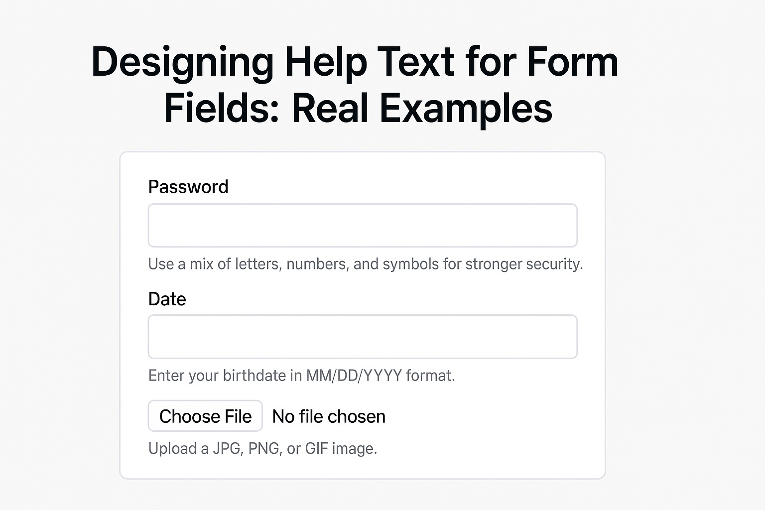
| Form validation errors | Use sparingly | A warning ⚠️ can help attention, but avoid softening genuine errors |
The pattern that emerges from this is consistent. Emoji slot in most naturally at moments of positive reinforcement or emotional warmth. They struggle at moments of tension, confusion, or formality. When a user is already frustrated, the last thing they need is a face emoji making the product feel like it is not taking their problem seriously.
Accessibility and Screen Readers
Here is something a lot of writers do not think about until it is too late. Screen readers read emoji aloud. Every single one of them.
When a screen reader encounters 🎉, it announces “party popper.” That might be fine at the end of a sentence like “You’re all set.” But if you have stacked three emoji at the start of a push notification, a screen reader user hears “sparkles, fire, star-struck” before getting to the actual message. That experience is confusing and, in some cases, completely blocks comprehension.
The W3C’s guidance on text alternatives makes clear that non-text content needs a text equivalent for users who rely on assistive technology. Emoji are non-text content. Using them purely for visual decoration, with no semantic value, puts them in a gray area for accessibility compliance.
A few things help here. Place emoji at the end of a phrase rather than the beginning. Users who are scanning for content hear the words first that way. Use no more than one or two per message. Then ask whether a user without sight would still fully understand the message if the emoji were removed. If the answer is no, the emoji is doing too much work on its own.
Cross-Platform Rendering and What It Means for Your Copy
Emoji do not look the same everywhere. The 😅 on iOS carries a slightly different expression from the same code point on Android. Some emoji that appear polished on macOS look flat or outdated on older Windows versions. This matters more than most product teams expect.
The 🔫 pistol emoji is a documented case of this going wrong at scale. Apple changed it to a water gun. Google followed. But for a period, the same copy rendered as a real gun on some platforms and a toy on others. The meaning shifted entirely depending on where the user opened the message. No writer intended that. It happened because the rendering environment was not checked.
Writers who rely on emoji to carry part of the meaning in their copy need to verify how those emoji actually render across the environments their users are in. Confirming emoji usage across platforms gives writers a factual starting point for checking what a symbol means and how it displays before it ships.
For product teams releasing to diverse device ecosystems, the safest approach is to treat emoji as visual reinforcement only. The words carry the meaning. The emoji support it. A rendering difference never breaks comprehension when the copy was not depending on the emoji to do semantic work.
Emoji Semantics Have Shifted More Than You Think
Some emoji have meanings that have drifted far from their original use. The 💀 skull once signaled danger. Now it is broadly used to mean “I’m dead” in the sense of something being extremely funny. The 🙃 upside-down face looks neutral at a glance but is almost universally used to express passive aggression or quiet despair.
If your onboarding copy uses 🙃 to signal a lighthearted “no problem, all good,” there is a real mismatch. The emoji says one thing. Your intended tone says another. Users fluent in internet culture will catch it immediately, and it will undercut your credibility faster than any word choice could.
Meanings vary by generation, region, and platform culture. What reads as warm and casual to one user group reads as sarcastic or dismissive to another. Checking semantics before writing is not optional for anyone shipping to a broad audience. It is the same discipline as checking that a word translates correctly for international users.
Emoji in Error Messages Deserve Their Own Rules
Error messages are where emoji decisions get most consequential. Users arriving at an error are already in friction. They want resolution, not charm.
A 😬 next to “Something went wrong” might feel relatable and human. For some users, it does. But for users who have lost work, missed a payment, or hit the same bug three times in a row, it reads as dismissive. The product is shrugging at them while they are trying to get something done.
The safer move with error messages is to write the clearest, most actionable copy possible. Then ask whether an emoji adds anything to that clarity. Usually it does not. A ⚠️ warning symbol can draw attention to a critical error without trivializing it. A face or gesture almost always introduces more risk than benefit in these moments.
Building an Emoji Position in Your Style Guide
If you are writing for a product with more than one contributor, you need a written position on emoji. Without one, different writers make different calls. The tone becomes inconsistent across screens, and users feel that inconsistency even if they cannot name it.
A solid emoji position in your content style guide covers these areas:
- Which surfaces allow emoji and which do not, for example push notifications versus legal copy
- A list of approved emoji that match the brand voice and have been verified across platforms
- Placement rules: end of sentence where possible, never embedded between two words in a phrase
- A frequency cap, such as one emoji per message in most contexts
- A requirement to test emoji with screen readers before anything ships
This does not have to be long. Even a single page in your style guide creates consistency across the team and cuts down on the last-minute copy debates that eat up review time.
Let the Copy Cast the Deciding Vote
The most useful test you can run before shipping emoji in any UI string is the removal test. Delete the emoji. Read the copy again. Does it still do its job? Does it still feel right for the moment it is serving?
If the answer is yes, the emoji was probably decorating the copy rather than supporting it. That is not always wrong. But it is worth knowing. Decoration adds visual noise, and in interfaces where users are completing tasks under real conditions, noise compounds.
If removing the emoji makes the message feel colder, more abrupt, or less human, that is a signal it was doing real work. That is the version of emoji use worth keeping. It means the emoji was part of the communication, not just a layer placed on top of it.
The best microcopy is invisible. Users do not notice it because it simply works. Emoji should operate by that same standard. When they are right, users feel the warmth without stopping to analyze where it came from. When they are wrong, users see the emoji before they read the message.
Write the words first. Then decide whether the emoji earns its place.