How to Set UI Character Limits Without Losing Clarity or Brand Voice
How to Set UI Character Limits Without Losing Clarity or Brand Voice
Your button fits perfectly. Then someone asks what it does. That is the trouble with trimming UI copy until it fits: you can solve the spacing problem and leave the reader with a bigger one. A useful character limit protects the meaning of a message while giving designers and developers something concrete to build around.
For UX writers, the goal is to agree on a workable budget, write within it, and test whether people still understand the result. Buttons, form labels, error messages and onboarding screens each need different rules. Their text has different jobs.
Three Rules for Copy That Fits
- Set character budgets around the task and available space.
- Keep the action, meaning and useful brand cues intact.
- Check draft lengths, then test the copy in real layouts.
Start With the Job Before Choosing a Number
A character budget is a drafting constraint. It tells a writer how much room to work with. It should also explain what the text must communicate and what can change if the message needs more space.
Before setting a limit, write down the reader’s question. A button answers, “What happens if I select this?” A form label answers, “What belongs here?” An error answers, “What happened, and how do I fix it?” An onboarding screen answers, “What can I do here, and why would I bother?”
Those questions give you a way to judge every cut. Removing “please” might leave the meaning intact. Removing “monthly” from a payment action could change someone’s understanding of the commitment.
Separate Drafting Targets From Hard Limits
Use a target range for writing and a hard limit only where a real constraint requires one. A target invites revision. A hard limit blocks delivery. Treating every preferred length as a technical ceiling creates unnecessary compromises.
For a first prototype, you might try 12 to 24 characters for primary buttons, 10 to 30 for form labels, 50 to 100 for inline errors, and 80 to 160 for onboarding body copy. These are sample starting budgets, not universal standards. Your components, language and tasks should decide the final numbers.
Document whether spaces and punctuation count. For these examples, they do. Keep titles, supporting text and actions in separate fields so a generous paragraph allowance does not hide an unusable button label.
Give Buttons Enough Room to Name the Action
Buttons need a clear verb and, where useful, an object. “Continue” can work when the next step is obvious. It becomes less helpful when the action sends an invitation, places an order or changes a subscription.
Before: “Click here to save your changes”
After: “Save changes”
The revision removes instructions about operating the interface. It keeps the outcome. At 12 characters, “Save changes” also gives you a compact candidate to test in a narrow component.
Before: “Yes, let’s get this invitation sent!”
After: “Send invitation”
The second version keeps a conversational product usable without asking the button to carry an entire personality. Put any welcome or encouragement in nearby supporting copy.
A smaller budget should never turn a meaningful action into a vague one. If “Delete account” exceeds the preferred width, review the component before replacing it with “OK.” The reader needs to recognize the consequence.
Keep Form Labels Short Without Making People Guess
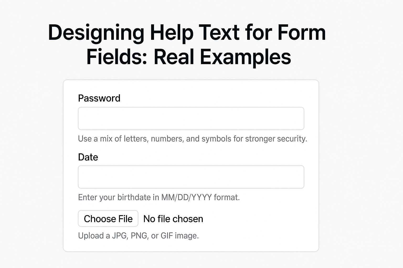
A label should name the information you need. Supporting instructions can explain format, purpose or restrictions. Trying to fit both jobs into the label often creates a long heading above a tiny field.
Before: “Please enter the email address you use for work”
After Label: “Work email”
Supporting Text: “Use the address connected to your team.”
The label is now 10 characters. The instruction has a separate place where it can wrap naturally. Keep that instruction only if it helps someone choose the right address.
Be careful with familiar-looking shortcuts. “Name” may be too broad if the product needs a billing name. “Address” may be ambiguous if a form also asks for a website. A few extra characters can prevent an avoidable correction later.
Test labels with empty fields. Placeholder examples can make an unclear label seem understandable during a design review. Ask whether the label still makes sense after someone enters a value and the example disappears.
Check Draft Lengths Before Reviewing Visual Fit
Once you have meaningful candidates, check their counts. Use UI character counter to compare draft lengths before placing the text into actual layouts. Keep spaces and punctuation in your drafting count so teammates can reproduce the result.
This gives you an editing checkpoint. If a button exceeds the agreed target, decide whether the extra wording earns its space. If it does, take that candidate into the design review instead of cutting it automatically.
A count cannot settle whether text fits. In a proportional font, letters have different widths. Two strings with the same character count can occupy different amounts of horizontal space. Font choice, font weight, button padding and screen width all affect the result.
Localization needs its own review too. Translated copy may need a different amount of space or a different sentence structure. Give translators context and access to the screen. An English character budget alone cannot tell them whether their wording will work.
Write Error Messages Around the Recovery Step
Error text needs enough space to help someone continue. Cutting a message to “Invalid input” might satisfy a tight budget, but it gives the reader another problem to solve.
Before: “Unfortunately, the information you entered does not meet our requirements.”
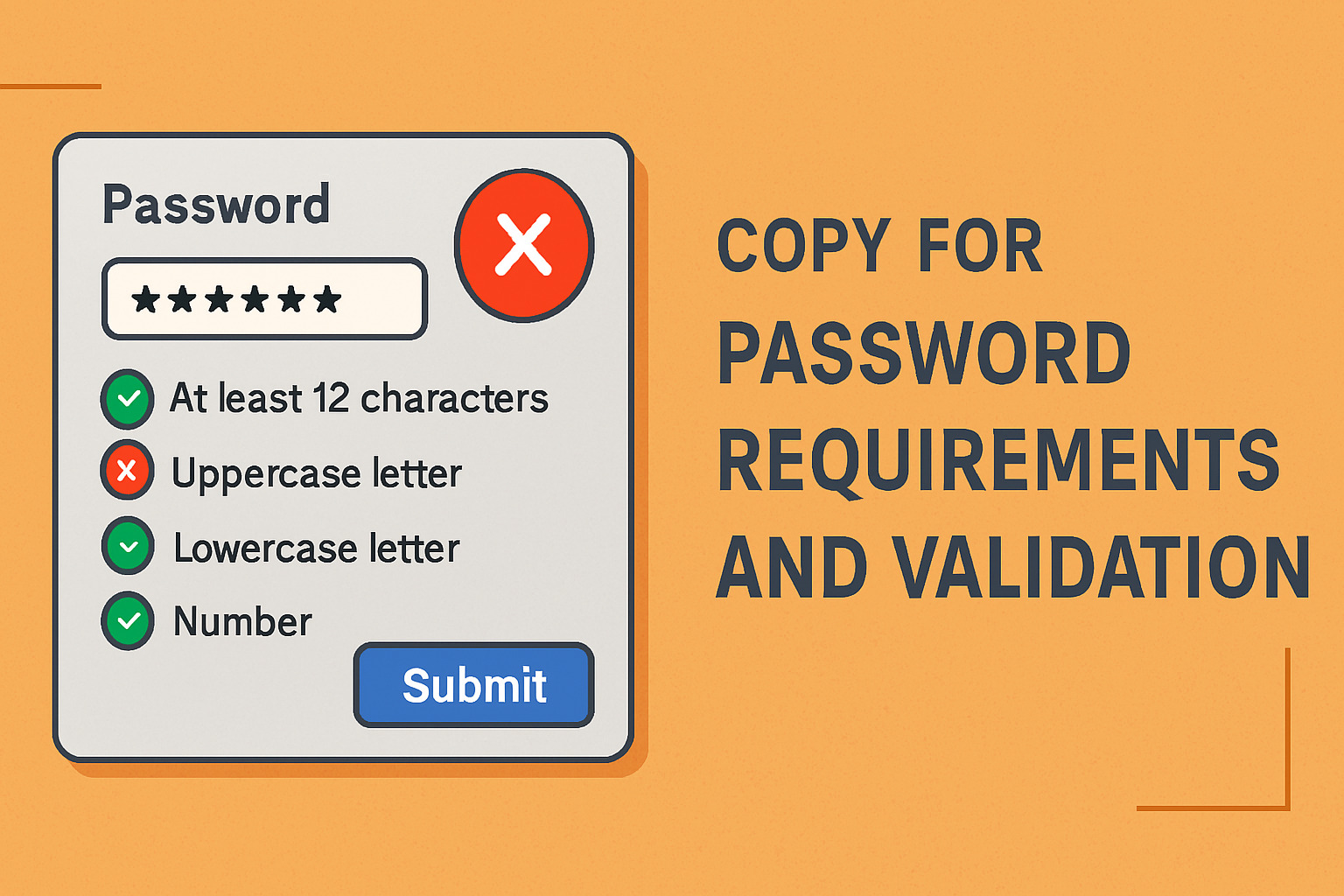
After: “Enter a password with at least 12 characters.”
Use this revision only if 12 characters is the actual requirement and length is the problem. If the password also needs other features, the interface must explain those requirements. A concise message that omits the reason for rejection is still incomplete.
Before: “Oops! Something went wrong with your upload.”
After: “This file is too large. Choose a file under 10 MB.”
The revision gives a reason and a next step. It also drops a playful reaction that may feel irritating after repeated failures. Again, the stated limit must match the product’s real upload rule.
Some errors need more space. A payment failure might require a retry option, an explanation of payment status or another payment method. Set a flexible error container before forcing that information into one short sentence.
Give Each Onboarding Screen One Clear Promise
Onboarding copy becomes easier to budget when each screen has one purpose. A screen that introduces a feature, requests permission, explains billing and celebrates account creation is carrying too much.
Before Heading: “Welcome to your exciting new home for productive teamwork”
After Heading: “Keep Project Files Together”
Before Body: “Our powerful workspace helps your entire team collaborate seamlessly and manage everything in one convenient place.”
After Body: “Add files to a shared project so your team can find the latest version.”
Before Button: “Let’s get started”
After Button: “Create project”
The revised set connects a benefit to an action. It also makes the copy easier to evaluate. Does the heading explain the benefit? Does the body explain the next step? Does the button name what happens?
Budget each part separately. A short heading does not justify a crowded paragraph. If the screen still feels dense, remove a secondary idea or introduce it at the point where someone needs it.
Preserve Brand Voice Through Word Choice
Brand voice does not need extra adjectives or a joke in every message. It can live in familiar verbs, direct sentences and a steady attitude toward the reader.
A friendly brand might prefer “Choose a file” to “Select an asset.” A precise brand might use “Download invoice” instead of “Get it.” Both choices express a voice while helping someone act.
Write a small voice rule for constrained spaces. For example: “Use everyday language, name the action and keep encouragement out of error messages.” That gives writers something they can apply when a phrase exceeds its budget.
Read the full screen aloud after editing. A warm heading beside a stiff label and a jokey error can sound like three different products. Voice needs consistency across the interaction, even when individual strings are tiny.
Test Understanding and Fit in the Same Review
A useful review checks whether people understand the copy and whether the interface can display it. Neither result guarantees the other. A tidy screen can still contain an unclear action.
- Place the copy in the component. Use the intended font, size, weight, padding and available width.
- Stress the layout. Review narrow screens, enlarged text, long names and representative translations.
- Ask for a prediction. Before someone selects a button, ask what they expect it to do.
- Watch a realistic task. Check whether people enter the expected information and recover from an error.
- Revise the constraint or the copy. Record what failed and test the changed version.
Keep the questions neutral. “Is this clear?” invites a polite answer. “What would you enter here?” gives you more useful evidence. For an error, ask what the person would try next.
Agree on acceptance criteria before the review. You might require the primary action to remain fully visible, labels to retain their meaning at narrow widths, and error messages to explain a workable recovery step. Choose criteria that match the component’s job.
Make the Budget Useful After Handoff
Store the approved wording with its component, purpose, target count and layout behavior. Include whether wrapping is allowed and what should happen when a translation needs more room.
A handoff note could read: “Primary action: Send invitation. Target: up to 24 characters including spaces. Keep the full action visible. Review longer translations with design.” That is more useful than an isolated number in a spreadsheet.
Ask developers to distinguish a writing target from a validation rule. An editorial budget should not silently become a restriction on what customers can enter into a field. Interface copy limits and user input limits serve different purposes.
Revisit budgets when fonts, components or supported languages change. A number that worked in an earlier layout may need adjustment in the next one.
Leave Room for the Words People Need
The best character budget makes writing decisions easier without taking meaning away. It gives a button room to name its action, a label room to identify its field, and an error room to explain a repair.
Start with the reader’s task. Draft a clear version, trim what adds little, and check the count. Then test the words where people will use them. When clarity and space disagree, bring the layout back into the conversation. Sometimes the right edit is a wider button.