A 404 page doesn’t have to feel like a dead end. Users land on these pages because something broke—a bad link, a deleted page, or a typo. That interruption doesn’t have to kill the experience. Smart microcopy and intentional design can soften the blow and redirect users without adding frustration.
Instead of leaning on generic lines like “Page not found,” you can turn this error page into a helpful touchpoint. It’s not about being clever for the sake of it—it’s about being helpful, on-brand, and clear. Here’s how to use microcopy to steer users back in the right direction.
Set Expectations in the First Line
The headline should acknowledge what happened—fast. Users don’t need a witty paragraph before they get clarity. Start with:
- “Looks like something went wrong.”
- “We couldn’t find that page.”
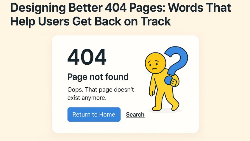
- “Oops. That page doesn’t exist anymore.”
Avoid passive, robotic phrases like “404 Error” or “Page Not Found.” They’re vague and offer zero guidance. Your headline needs to be human, direct, and empathetic.
Offer a Way Out Immediately
Users landed on a broken page. Don’t leave them stranded. Offer meaningful paths forward.
Include:
- A homepage link: “Back to Home”
- Search bar: “Try searching for what you need”
- Popular destinations: “Here’s where most people head next”
Give these elements real language, not just “click here” links. Pair each with a short line of text to explain why they’re useful.
Align the Tone With the Brand
A 404 page doesn’t exist in a vacuum. The tone of your microcopy should match the product’s voice.
- For a banking app: Keep it straight and confident. “That link’s expired. Let’s get you back to what matters.”
- For a kids’ game site: Go playful. “Uh-oh! Our squirrels can’t find this page.”
- For an e-commerce store: Keep it friendly. “This page might be out of stock.”
Don’t write in a vacuum. The user is still interacting with your brand. Keep it familiar.
Humor Works—If It’s Backed by Helpfulness
Humor on 404 pages can work, but only if it doesn’t block function. A joke can’t replace action.
Example:
“This page is as lost as your last sock in the laundry.”
[Return to Home] [Shop Best Sellers]
Add personality, but keep usability front and center.
Guide with Micro-Interactions
Even a simple 404 can use small UI touches to support recovery:
- Use buttons instead of plain text links for clear direction
- Add visual hierarchy to prioritize most helpful paths
- Don’t clutter with too many choices
Give users a strong, clear next step and place it above the fold.
Add Illustrations Without Cluttering
Illustrations can soften the experience—especially on mobile. Consider using lightweight PNG icons or illustrations to support the tone. A broken compass icon or a confused character can visually reinforce the copy.
If you’re using illustrations, make sure they don’t overpower the functional elements. For performance and design balance, link out to free PNG resources that offer optimized assets. Tools like free PNG image libraries can supply minimal, transparent illustrations that work well on light and dark backgrounds.
Write Alt Text for Any Visuals
Even on error pages, accessibility matters. If you’re using a PNG icon of a sad robot or a lost map, describe it with relevant alt text. A simple “Illustration of a confused robot holding a broken sign” adds context for screen reader users.
Show What Might Have Gone Wrong
You don’t need to over-explain, but a short line like “The page might have been deleted or moved” gives a clear reason without blame. It also prevents users from thinking the error is on their side.
Keep it brief, but don’t leave them guessing.
Encourage Feedback (When It Makes Sense)
If the 404 happens often or affects logged-in users, consider adding a small “Report this issue” link. Keep it optional, but use inviting language like:
- “Think this is a mistake? Let us know.”
- “Help us fix it: report the issue.”
Make sure this action is low friction and doesn’t ask for too much detail.
Real-World Examples That Work
1. GitHub
“This is not the web page you are looking for.”
A playful Star Wars nod, followed by helpful navigation links.
2. Slack
“There’s been a glitch…”
Straightforward headline, colorful background, and links to helpful documentation and support.
3. Hootsuite
“Oh snap! We got lost.”
Illustration of an owl with coffee, plus clear CTA buttons. Tone is friendly and helpful.
These examples pair tone, visuals, and user direction into a cohesive fallback page.
Summary Checklist: Writing 404 Microcopy That Works
- Direct headline that tells users what happened
- Short paragraph that shows empathy or adds clarity
- Clear CTA(s) that help users move forward
- On-brand tone consistent with the rest of the site
- Optional illustration with PNG icons for mood support
- Helpful alt text for accessibility
- No blame language
- Optional feedback link
A 404 page is never the goal, but it’s part of the journey. Strong microcopy and intentional design make that detour feel like a brief pause—not a dead end. Add visual support where it helps, write for clarity, and always give users somewhere to go next.