A well-written CTA guides users to take the desired step, such as signing up for a newsletter or making a purchase. It answers the question: how can you motivate your audience to act immediately? A clear CTA is brief, direct, and persuasive. It focuses on the core benefit the user will receive by clicking.
Understanding the Purpose of a CTA
A CTA should be straightforward and compelling. Every word must serve a purpose. A powerful CTA drives engagement, reduces friction, and increases conversion rates. When users see a clear instruction, they know exactly what to do next. This clarity reduces hesitation and boosts confidence in their decision.
Key Elements of an Effective CTA
- Action-Oriented Language
Use verbs that prompt immediate action. Words like “Join,” “Start,” “Try,” and “Get” push the reader toward a decision. The language must be concise and to the point. - Visual Emphasis
The design plays a major role in attracting attention. Bold typography, contrasting colors, and ample white space can direct the viewer’s eye to the CTA. The visual style should be consistent with the overall design of the site to create a seamless experience. - Value Proposition
A strong CTA clearly communicates what the user will gain. Whether it is exclusive content, a discount, or a new experience, the benefit should be obvious. This direct communication builds trust and encourages immediate response. - Placement and Timing
The position of the CTA on the page affects its effectiveness. Place it where it is easily noticeable, such as near important content or at the end of a compelling section. Ensure the timing matches the user’s journey through the site. - Simplicity and Brevity
Avoid clutter. A brief message is more memorable and easier to process. The fewer the words, the stronger the impact. Keep the design and text streamlined to prevent distraction.
Steps to Create Your CTA
- Define Your Goal
Identify what action you want your users to take. Whether it is subscribing to updates or purchasing a product, clear goals set the direction for the message. - Write Clear Copy
Craft a message that is easy to understand. The tone should be friendly yet assertive, encouraging users to act without second thoughts. - Focus on the Benefit
Explain the advantage of clicking the button. Users respond better when they see a direct benefit, such as saving time, enjoying discounts, or accessing premium features. - Choose a Prominent Design
Decide on the button’s size, color, and shape. The design should be attention-grabbing without overwhelming the rest of the page. Consistency with your site’s overall style reinforces trust. - Test and Optimize
Use A/B testing to measure performance. Try different phrases, colors, and placements. Analyze user interactions to determine which version leads to higher engagement. Iterate based on data for the best results.
Practical Tips for Strong CTAs
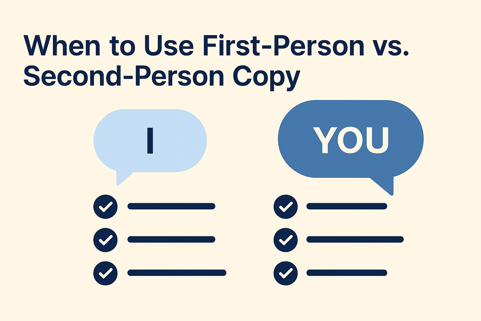
- Use First-Person Language
Research shows that a first-person narrative can increase conversion rates. Phrases like “Start my trial” or “Claim my offer” can create a personal connection. - Highlight Urgency or Scarcity
Introducing time-sensitive language motivates users to act quickly. Statements such as “Limited offer” or “Only a few left” inspire immediate action. - Create a Sense of Community
Mentioning how joining a group or network brings benefits can resonate with users. A CTA that hints at a collective experience can prompt a stronger response. - Maintain Consistency Across Channels
The CTA on your website should match other marketing channels. Consistency builds familiarity and reinforces your brand message across emails, social media, and ads. - Utilize White Space
Surround your CTA with enough white space so it stands out. A clutter-free design makes the message clearer and increases the likelihood of engagement.
Examples of Clear CTA Statements
- “Join our newsletter for exclusive insights”
- “Start your free trial now”
- “Claim your discount today”
- “Get started with our easy setup”
- “Sign up to access premium content”
Each example is simple, direct, and provides a benefit. They use action verbs and minimize unnecessary text, which helps reduce cognitive load on the reader.
Final Thoughts on Crafting a CTA
The process of creating a clear call-to-action involves understanding your audience, defining a purpose, and crafting a message that aligns with both. Focus on clarity, visual appeal, and direct language. Testing and refining the CTA based on user feedback is necessary to maximize its effectiveness.
A clear CTA creates a path for users to follow. By concentrating on the benefits, maintaining a simple design, and using persuasive language, you can guide visitors to the next step with confidence and clarity.


