Beta invites often mark the first point of contact between your product and a potential user. The words used on these pages either build anticipation or trigger doubt. Copy has to work harder than usual—conveying value, trust, and simplicity in just a few lines. It also has to respect friction. Too many barriers, and interest drops. Too little clarity, and the user walks away confused.
This article breaks down how to write microcopy that guides, reassures, and converts visitors on beta or early access pages. The goal: get them to sign up, feel safe doing so, and stay engaged.
1. Be Direct About Value Without Overselling
Vague promises like “It’s going to change your life” sound generic. Instead, explain what the user will actually get during early access.
Examples of strong value microcopy:
- “Test features before they launch publicly”
- “Get early access to productivity workflows we’re still shaping”
- “Try the AI editor and share your feedback—your voice shapes v2”
Avoid hype. Favor clarity. People are skeptical, not easily impressed.
2. Use Button Text That Reflects Commitment Level
CTA buttons on beta pages should mirror user expectations. If they’re just signing up to get notified later, don’t write “Join Now” or “Start Free Trial.” Those phrases imply instant usage and may cause hesitation.
Better alternatives based on intent:
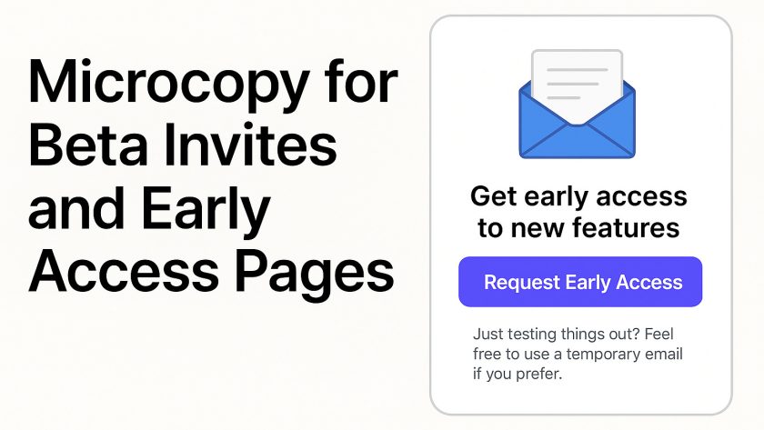
- “Request Early Access”
- “Join the Waitlist”
- “Notify Me When Ready”
- “Apply for Beta”
The fewer surprises post-click, the more likely the user is to finish the journey.
3. Clarify What Happens After Sign-Up
Lack of follow-up clarity can create friction. Will the user get access instantly? Will there be a wait? Is approval manual?
Use helper text below the form or in a confirmation message to set expectations.
Helpful microcopy examples:
- “We’re rolling out invites weekly—watch your inbox”
- “You’ll receive an access code within 24 hours”
- “Beta is currently full, but you’ll be next in line”
Users want context. Give them confidence in what to expect.
4. Keep Forms Short and Optional Where Possible
Lengthy forms kill momentum. If you need extra info (like job role or company size), mark it as optional or explain why it’s needed.
Suggested field-level microcopy:
- (for optional fields) “Helps us tailor your experience—optional”
- (for company size) “Used to match you with features most relevant to your team”
Better yet, reduce the ask entirely. In many cases, only an email is enough.
5. Acknowledge Privacy Without Overdoing It
People don’t like giving up their email unless there’s trust. One line of thoughtful copy can reduce that resistance.
Examples:
- “No spam. Just early access updates.”
- “We’ll never share your email. That’s a promise.”
- “Only used to send your invite.”
This small line, often overlooked, does more work than a 20-page privacy policy.
6. Offer Temporary Email as a Legitimate Option
Some users want to try your beta without committing their primary email. Instead of blocking them, make space for them.
You can include a gentle suggestion:
“Just testing things out? Feel free to use a temporary email if you prefer.”
Linking to a trusted temporary email provider here adds convenience. It shows your team understands trial behavior and respects privacy choices.
Allowing temporary emails can also be beneficial during internal QA, early testing with external contractors, or sharing access in public communities. It reduces friction, which helps spread awareness organically.
7. Reward the Waiting Experience
If there’s a delay between sign-up and access, use the time wisely. Confirmation screens and follow-up emails should give the user something beyond a placeholder.
Microcopy ideas:
- “While you wait, check out how we’re building things on our blog”
- “You’ll be the first to try it—get ready”
- “Want to move up the waitlist? Share your referral link”
Filling the gap with useful action points keeps the user warm and interested.
8. Speak Like a Human, Not a Landing Page Template
Avoid corporate jargon or startup clichés. Read your microcopy out loud. If it sounds like a press release, rework it.
Dry: “Gain access to our cutting-edge beta and help revolutionize productivity workflows.”
Better: “Try out our upcoming tools. Tell us what works, what doesn’t, and what’s missing.”
Write like someone is on the other side reading it. Because they are.
9. Use Social Proof with Caution
If your product is early, user quotes or testimonials might not exist yet. That’s fine. Focus instead on small, believable indicators.
Examples:
- “3,200 people are already on the waitlist”
- “Used internally by our team every day”
- “We’re building this based on feedback from 50+ product managers”
Real signals beat vague trust badges or meaningless logos.
10. Microcopy Placement Matters
Don’t dump all your messages in one block. Spread copy across touchpoints:
- Under input fields
- Beside buttons
- In toast messages
- In confirmation modals
- Inside emails
Each word should do one job: build trust, clarify action, or manage expectations.
Summary Checklist for Beta Page Microcopy
✔ Be clear about what the user gets
✔ Match CTAs to actual user actions
✔ Set expectations immediately
✔ Offer a way in for skeptical or privacy-conscious users
✔ Make temporary emails an option, not a blocker
✔ Keep everything short, human, and frictionless
The beta sign-up flow is more than just a gateway—it’s a conversation. Write each part of that conversation with care, and people won’t just sign up. They’ll stick around.


