Designing Help Text for Form Fields: Real Examples
Designing help text for form fields is a fine art that blends clarity and subtle guidance. Clear help text reduces user errors and provides direction when filling out forms. Well-crafted assistance can boost completion rates while making users feel comfortable and confident. This article discusses practical techniques and showcases real examples to illustrate the art of designing useful help text.
Understanding the Role of Help Text
Help text supports users by offering precise instructions at the moment they need it most. Good examples include messages for password creation rules, guidelines for proper input, or information about file upload requirements. Providing targeted details prevents common mistakes and decreases frustration. The message must be brief and accurate to fit naturally into the form without overwhelming the user.
Elements of Effective Help Text
Successful help text embodies several key elements:
- Clarity: Every word counts when guiding the user. The text should use plain language and short sentences.
- Placement: Help text should appear near the form field it supports, ensuring that the guidance is timely and relevant.
- Visibility: A subtle design can differentiate help text from the rest of the form content while keeping it noticeable.
- Context: Tailor the instructions to the specific field. An email field might include a reminder about format, while an image upload field might require format or size details.
Real Examples in Action
Real examples provide insight into designing help text that feels natural. Consider the field for an image upload where a hint might read: “If you’re uploading from an iPhone, convert HEIC to JPG before submitting.” This message, tucked neatly below the upload field, assists users in preparing their files correctly. It is straightforward and provides a tangible tip that can prevent file compatibility issues.
Other practical examples include:
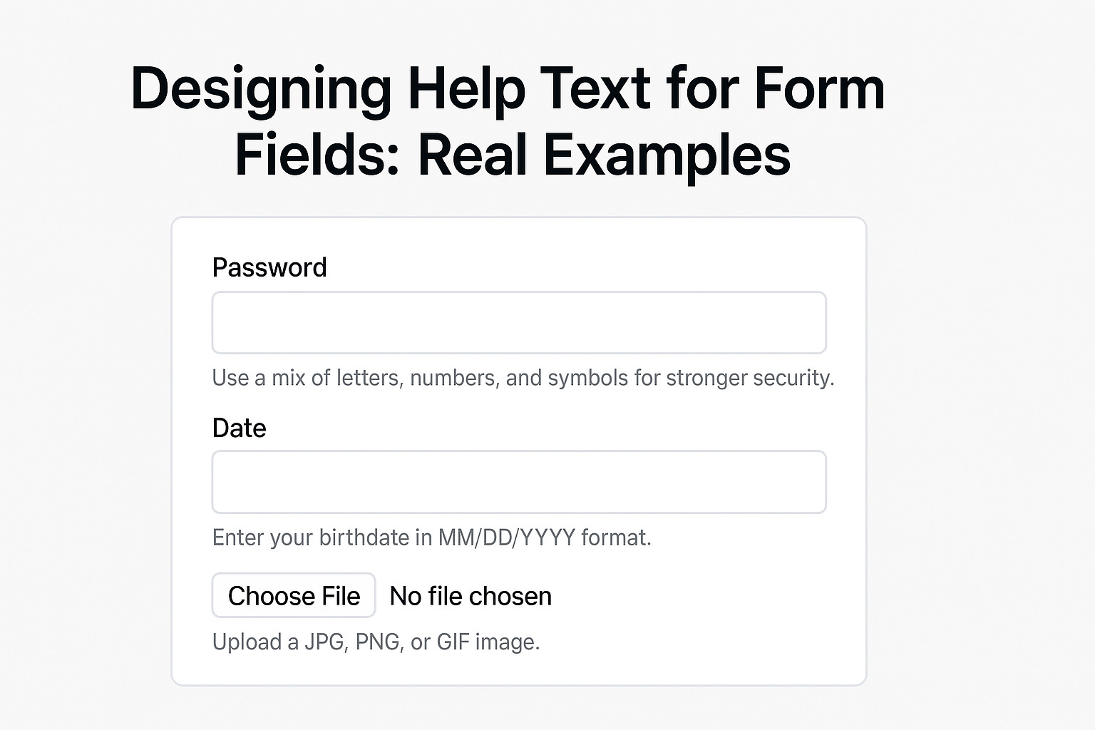
- Password Fields:
- “Use a mix of letters, numbers, and symbols for stronger security.”
- “Passwords must be at least 8 characters long.”
- Date Fields:
- “Enter your birthdate in MM/DD/YYYY format.”
- “Dates must be entered using numerical values only.”
- Email Input:
- “Provide your email in the format user@example.com.”
- “Double-check for typos to ensure delivery of confirmation messages.”
These examples display clear instructions without overwhelming the user. The text appears as a helper rather than an intrusive feature. It is crafted to assist users seamlessly during the form-filling process.
Best Practices for Crafting Help Text
To design effective help text, consider these strategies:
- Keep It Short and Direct: Aim for brevity while conveying necessary information. Avoid extraneous details that may confuse users.
- Match the User’s Tone: Adapt the language to the audience. For formal contexts, use a professional tone; for more casual forms, a friendly voice works best.
- Use Visual Cues: Icons, color accents, or subtle animations can highlight help text without drawing excessive attention.
- Test with Real Users: Observing users interact with forms can reveal where additional guidance is needed. Feedback from testing helps refine the text for maximum clarity.
- Consider Accessibility: Ensure that help text is legible for all users, including those relying on screen readers. Proper HTML labeling and contrast settings contribute to a more inclusive experience.
Structuring Help Text Within the Form
The arrangement of help text within the form contributes significantly to its effectiveness. Position the guidance immediately before or after the corresponding field. Use formatting such as italics or a slightly smaller font size to differentiate it from the main label. Visual separation aids comprehension without distracting from the form’s overall design.
Evaluating the Impact of Help Text
Measure the effectiveness of your help text by analyzing completion rates and user feedback. A/B testing different phrasing or placement can reveal which design reduces errors and enhances user satisfaction. Monitoring performance helps you adjust strategies over time and align the form with user needs.
By integrating these techniques into your design process, help text becomes a valuable asset that supports users in providing accurate information. The emphasis remains on creating a seamless experience, where every sentence contributes directly to guiding the user through the form fields with ease and precision.