Designing Onboarding Screens That Actually Help
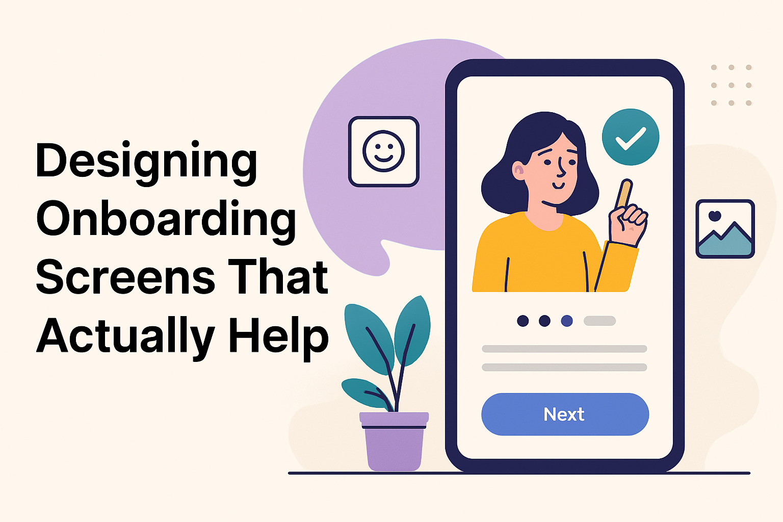
User onboarding is more than a brief welcome; it sets the tone for the entire experience. Clear guidance, engaging design, and thoughtful interactions ensure that users feel comfortable and confident when they start using your product. Good onboarding screens lead to smoother interactions and reduced confusion. Every element should work together to teach, inform, and encourage without overwhelming the user.
Establishing a Clear Path
Onboarding screens should present a clear path for users to follow. The process must highlight the core functions and benefits of the product. A well-crafted sequence of screens helps users understand what actions to take and why those actions matter. Here are some strategies to achieve this:
- Simple Navigation: Use intuitive icons and buttons that signal where the user should click next.
- Brief Instructions: Provide concise text that explains the purpose of each step without unnecessary detail.
- Visual Hierarchy: Organize information so that the most important details are prominent, allowing users to quickly grasp the main points.
- Progress Indicators: Include visual cues that show users their current step within the process.
Balancing Information and Interaction
Overloading screens with text can overwhelm users. Instead, information should be distributed across multiple stages, keeping each screen focused on a single concept. A mix of short sentences, bullet points, and visual aids creates an inviting atmosphere that encourages continued exploration.
Interactive elements, such as buttons and clickable images, make the experience more engaging. Users learn best when they can try out features in a controlled setting. Providing a sandbox-like environment during onboarding allows users to practice before they face real tasks.
Integrating Visual Elements
Visual elements play a critical role in making onboarding screens engaging. Simple icons, illustrations, and animations add a human touch that transforms a sterile process into an inviting experience. Adding friendly illustrations or branded PNGs can ease users into your product. There are plenty of free PNG images to explore. The design should align with the product’s overall style and voice, ensuring that users feel a consistent look and feel across the platform.
Providing Immediate Value
Onboarding should focus on immediate user value. Introduce key features that can solve real problems. Explain how the product makes everyday tasks easier. Users appreciate when they can see a clear benefit right away. A few specific tactics include:
- Use Cases: Present practical examples of how the product can be used in daily activities.
- Short Tutorials: Offer brief, step-by-step tutorials that introduce the primary functions without getting lost in details.
- Contextual Help: Integrate tooltips and hints that provide information only when needed.
Encouraging User Feedback
User input is essential in refining the onboarding experience. Invite users to share their thoughts and experiences after completing the onboarding process. This feedback loop can reveal hidden obstacles or confusing instructions. With this information, iterative improvements can be made to streamline the experience even further. Consider these methods for gathering feedback:
- Surveys: Short, targeted surveys immediately after onboarding can capture fresh impressions.
- Interactive Prompts: In-app questions can engage users in real time.
- Analytics: Monitor user behavior to see where drop-offs occur and adjust the screens accordingly.
Optimizing for Different Devices
Onboarding screens must perform well on all devices. Whether users access your product via desktop, tablet, or mobile, the design must adapt seamlessly. Responsive design techniques ensure that text remains legible, buttons are easily clickable, and images display correctly across various screen sizes. Testing on multiple devices is essential to guarantee a smooth user journey.
Staying Focused on the User
Every decision in the onboarding design should stem from a desire to make the user feel supported and understood. Simplicity, clarity, and consistency create an environment where users feel confident in navigating the product. Avoiding excessive jargon and focusing on everyday language helps to reduce any barriers that might prevent a smooth start.
The careful integration of text, visuals, and interactive elements leads to onboarding screens that truly help users. Each decision should build toward an experience that makes starting with your product a pleasant and productive moment. By focusing on clear instructions, immediate benefits, and responsive design, you create onboarding screens that serve as a reliable guide for every new user.